Tl;dr: We see extensive and unexpected short-scale variation in coverage levels in both RNA-seq and DNA-based sequencing. Can anyone point us to resources that might explain this?
I'm going to start not with our DNA-uptake data but with some H. influenzae RNA-seq data. Each of the two graphs below shows the RNA-seq coverage and ordinary seq coverage of a 3 or 4 kb transcriptionally active segment.
Each coloured line shows the mean RNA-seq coverage for 2 or 3 biological replicates of a particular strain. The drab-green line is from the parental strain KW20 and the other two are from competence mutants. Since these genes are not competence genes the three strains have very similar expression levels. The replicates are not all from the same day, and were not all sequenced in the same batch. The coloured shading shows the standard errors for each strain.
We were surprised by the degree of variation in coverage across each segment, and by the very strong agreement between replicates and between strains. Since each segment is from within an operon, its RNA-seq coverage arises from transcripts that all began at the same promoter (to the right of the segment shown). Yet the coverage varies dramatically. This variation can't be due to chance differences in the locations and endpoints of reads, since it's mirrored between replicates and between strains. So our initial conclusion was that it must be due to Illumina sequencing biases.
But now consider the black-line graphs inset below the RNA-seq lines. These are the normalized coverages produced by Illumina sequencing of genomic DNA from the same parental strain KW20. Here there's no sign of the dramatic variation seen in the RNA-seq data. So the RNA-seq variation must not be due to biases in the Illumina sequencing.
Ignore the next line - it's a formatting bug that I can't delete.
<200 and="" from="" in="" lower="" nbsp="" p="" segment.="" segment="" the="" to="" upper="">
But now consider the black-line graphs inset below the RNA-seq lines. These are the normalized coverages produced by Illumina sequencing of genomic DNA from the same parental strain KW20. Here there's no sign of the dramatic variation seen in the RNA-seq data. So the RNA-seq variation must not be due to biases in the Illumina sequencing.
Ignore the next line - it's a formatting bug that I can't delete.
How else could the RNA-seq variation arise?
- Sequence-specific biases in RNA degradation during RNA isolation? If this were the cause I'd expect to see much more replicate-to-replicate variation, since our bulk measurements saw substantial variation in the integrity of the RNA preps.
- Biases in reverse transcriptase?
- Biases at the library construction steps? I think these should be the same in the genomic-DNA sequencing.
Now on to the control sequencing from our big DNA-uptake experiment.
In this experiment the PhD student mixed naturally competent cells with chromosomal DNA, and then recovered and sequenced the DNA that had been taken up. He sequenced three replicates with each of four different DNA preparations; 'large-' and 'short-' fragment preps from each of two different H. influenzae strains ('NP' and 'GG'). As controls he sequenced each of the four input samples. He then compared the mean sequencing coverage at each position in the genome to its coverage in the input DNA sample.
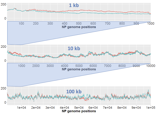
Here I just want to consider results of sequencing the control samples. We only have one replicate of each sample, but the 'large' (orange) and 'short' (blue) samples effectively serve as replicates. Here's the results for DNA from strain NP. Each strain's coverage has been normalized as reads per million mapped reads (long: 2.7e6 reads; short: 4.7e6 reads).
The top panel shows coverage of a 1 kb segment of the NP genome. Coverage is fairly even over this interval, and fairly similar between the two samples. Note how similar the small-scale variation is; at most positions the orange and blue samples go up and down roughly in unison. I presume that this variation is due to minor biases in the Illumina sequencing.
The middle panel is a 10 kb segment. The variation looks sharper only because the scale is compressed, but again the two traces are roughly mirroring each other,
The lower panel is a 100 kb segment. Again the variation looks sharper, and the traces roughly mirror each other. Overall the coverage is consistent, not varying more than two-fold.
Now here's the corresponding analysis of variation in the GG control samples. In the 1 kb plot the very-small-scale position-to-position variation is similar to that of NP and is mirrored by both samples. But the blue line also has larger scale variation over hundreds of bp that isn't seen in the orange line. This '500-bp-scale' variation is seen more dramatically in the 10 kb view. We also see more variation in the orange line than was seen with NP. In the 100 kb view we also see extensive variation in coverage over intervals of 10 kb or larger, especially in the blue sample. It's especially disturbing that there are many regions where coverage is unexpectedly low.
The 500-bp-scale variation can't be due to the blue sample having more random noise in read locations, since it actually has four-fold higher absolute coverage than the orange sample. Here are coverage histograms for all four samples (note the extra peak of low coverage positions in the GG short histogram):
If you've read all the way to here: You no doubt have realized that we don't understand where most of this variation is coming from. We don't know why the RNA-seq coverage is so much more variable than the DNA-based coverage. We don't know how much of the variation we see between the NP samples is due to sequencing biases, or noise, or other factors. We don't know why the GG samples have so much more variation than the NP samples and so much unexpectedly low coverage. (The strains' sequences differ by only a few %.)
We will be grateful for any suggestions, especially for links to resources that might shed light on this.
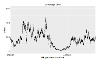
Later: From the Twitterverse, a merenlab blog post about how strongly GC content can affect coverage: Wavy coverage patterns in mapping results. This prompted me to check the %GC for the segment shown in the second RNA-seq plot above. Here it is, comparing regular sequencing coverage to %GC:
I don't see any correlation, particularly not the expected correlation of high GC with low coverage. Nor is there any evident correlation with the RBNA-seq coverage for the same region.


