Field of Science

Does variation in sequencing coverage help explain apparent variation in recombination?

Preamble:  The grad student and I have been looking at the Illumina sequencing coverage of the DNAs used for our DNA-uptake project, and considering how best to exclude from analysis the bits of the genome that consistently have very low coverage.  We're probably just going to exclude all positions that have fewer than 10 reads in the control 'input' DNA sample.  But thinking about this got me thinking about the extent to which position-specific differences in coverage could influence the estimates of recombination frequency in the sister project I'm doing with the former post-doc.

Here's a figure showing how dramatic the variation in coverage is (two 50 kb segments of the genome):


Here's a quick overview of the recombination project.  We transformed the Rd strain with DNA from the divergent NP strain, pooled 10,000 novR colonies, and genome-sequenced the pooled DNA at 20,000-fold coverage to measure the frequency of NP alleles at the ~35,000 SNP positions where the two strains differ.  This gave a genome-wide map of recombination frequency that showed surprisingly high variation.  The graph below shows the reproducibility of this variation across independent samples (one with colonies selected for novR and the other for nalR).


We need to check that some of the apparent differences in recombination frequency at different positions aren't actually due to differences between the sequencing efficiencies of the Rd and NP SNP alleles at these positions.  The former post-doc and I had a Skype conversation about this this morning.  Here's our plan.

He has the control sequencing data:  coverage for each position in the control NP genome sample and in the control Rd sample, each aligned to its own reference genome.  To simplify the comparisons he'll first normalize each data set to its mean coverage.  If we were to plot the SNP-position coverages against each other we'd expect to see something like this:


For each of the ~35,000 SNPs, the ratio of its NP allele and Rd allele coverages (call it the 'bias ratio') tells us how much sequencing biases could influence its apparent recombination rate.  

Now all the former postdoc needs to do is calculate the correlation between the bias ratios and the estimated recombination rates across the genome.  If he sees little or no correlation, then sequencing biases are not contributing to the measured frequencies of NP alleles in the recombinant-genome DNA pool and we can continue to search for the factors that do contribute.  But if he sees a solid correlation then we need to investigate further.

Steps for the former post-doc:  
  1. Normalize control-genome sequencing coverages to their means.
  2. Calculate bias ratios for each SNP.
  3. How much of the recombination variation is explained by the bias ratios? 

Making sense of RNA-seq comparisons

***Hey, it's RRResearch's 10th blogiversary!***

Back to work:

I'm working on the toxin-antitoxin manuscript, and trying to use the RNA-seq data to decide which genes have changed expression in which mutants.  This information should help us understand how the toxin acts to prevent DNA uptake, and what else it might affect.

The comparisons should be straightforward because the former undergrad/summer student left me with a superb set of analyses and R scripts, including EdgeR and DESeq2 analyses comparing expression of different strains at the various time points.  But I'm having a hard time making sense of the results, because some comparisons that I expect to give few significant differences give many, and others give very few.

There are also big inconsistencies between the EdgeR and DESeq2 results.  For example, in one comparison of two mutant strains (taxx vs antx, at time M1), EdgeR finds no genes that are significantly different but DESeq2 finds about 70 genes, with a cutoff for 'significant' that requires both of the following:
  1. must have padj or FDR score less than 0.05<0 .05="" li="">
  2. must have at least a twofold change in expression
In fact, all but two of the genes in this EdgeR comparison have FDR values greater than 0.5, and almost all have FDR values of 1.00.


I had a Skype conversation with the former post-doc this morning, and he suggested an analysis that might clear things up for me.  But I'll need to ask the former student to do it for me, or to modify the R scripts so I can do it.

Step 1:  Identify all the genes whose expression is significantly changed at each of the MIV timepoints (M1, M2 and M3), relative to their expression in log phase in sBHI (M0 timepoint).

Step 2:  Using the same cutoff, examine the genes that differ significantly between different strains at a single time point.  How many of these are also among the 'MIV-induced' set for this timepoint?

If we find that a particular genetic difference (wildtype vs a mutant, or two mutants vs each other) causes changes in the same genes that are changed by MIV in wildtype cells, we could conclude that the genetic difference affects the cellular response to MIV.  If there's no more overlap than we'd expect by chance, then no.

Evidence for a likely sample switch in the RNA-seq dataset (or not)

I've been working on the toxin/antitoxin manuscript, trying to extract all the conclusions from the RNA-seq data trove.  We have two odd results, and I now think they are both best explained by a sample switch in the first set of samples.

One odd result that the former post-doc drew my attention to is that, when the antitoxin is deleted, expression of the competence genes appears to be down at the last time point ('M3', 100 minutes incubation in MIV competence-induction medium).

The other odd result, which I just discovered a couple of days ago, is that, when the toxin gene is deleted, expression of the competence genes appears to be up at the second time point ('M1'; 10 minutes in MIV).

Each of these results is based on the mean of three biological replicates (samples pf the same strains cultured on different days).  I now think that they're reciprocal consequences of the same problem - switched identities of one pair of samples prepared on the same day.

History: I was originally focusing on the apparent up-regulation in the toxin deletion, which I discovered in comparisons of the toxin ('toxx') and toxin+antitoxin ('taxx') knockouts.  I was looking at this comparison because it's the only one where we would expect to see any expression differences that might be caused by action of the antitoxin on genes other than the toxin, and I wanted to know if we could rule these out.

The former summer undergrad had done pairwise comparisons of all the different mutants we'd tested, using both the Edge and DESeq2 packages, so I looked at the Excel files he'd generated comparing the toxx and taxx samples, sorting the expression ratios for each timepoint.  I was quite surprised to see that, with the Edge dataset, the genes with the most extreme expression differences at the M1 timepoint were ALL the competence genes (see below).  But there was no overexpression at the M2 timepoint, contrary to what I would expect if this was a competence-related effect, and inconsistent effects at M0 and M3.


So I was worried that this might be due to a problem with only one of the three replicate samples that had been averaged, so I looked at the before-averaging data.  Initially I suspected that two of the taxx samples (M2_E and M3_E) had been switched.  That might still be true, but it was a small effect compared to the bigger toxx anomaly I found when I plotted bar graphs of competence gene coverage for all the taxx and toxx samples.  The graph below is for expression of the comABCDEF operon in the taxx mutant (∆toxT),  but I found the same anomaly for the other operons:  the M1_A sample has much higher expression levels than we normally see at this time (usually only slightly higher than the M0 timepoint).


Now I was suspicious that this 'A' sample might be misidentified - not at M1 timepoint at all.  So I looked at all the samples that had been prepared on this day (Day 'A').  These samples were prepared by the  former research associate; they were the first RNA prep she did for what turned into the big RNA-seq dataset.  Here's the plot of all her Day A samples.


Consistent with my sample-switch hypothesis, the overly high competence-gene expression levels in the toxx M1 sample is balanced by overly low competence gene expression in the antx (∆toxA) M3 sample!  Again I'm only showing the comABCDEF operon, but pilABCD and comNOPQ show the same pattern.  

So my new hypothesis is that the antx_M3 sample and toxx_M1 sample were switched.  This is a good discovery, because it probably explains both the apparent reduction of competence gene expression at M3 in the antx samples and the apparent increase in competence-gene expression at M1 in the toxx samples.  But it's a big hassle, because if I'm right we'll need to redo all the bioinformatics analyses that involve these samples.  Luckily the summer undergrad is still in the picture, and the R scripts left us with should make this task easy.

But I want to be as confident as possible that my switch hypothesis is correct.  The best prediction is that we should see overexpression of toxT and absence of toxA in sample toxx_M1, and the reverse in sample antx_M3.  

(...Pause while I create this graph...)

But we don't!  


One confounding issue is that the expression scoring detects coverage of the remaining ends of the genes, because they weren't completely deleted.  (I can get the former summer student to look at the actual toxT and toxA coverage for each sample to confirm whether the deletions are present.)  

With this taken into account, I think we see the expression we would expect if the samples were not switched.  For the antx samples, we see elevated expression of toxT and toxA at all time points, and for the toxx samples we see normal (like KW20) expression of toxA and reduced expression of toxT. Importantly, the antx_M3 sample has much higher expression of toxT than the toxx_M1 sample.  So I think my hypothesis must be wrong!

OK, now I've checked the expression of toxA and toxT in the samples from other days, and they're nicely consistent with the expression in the Day A samples.  So I guess the samples are not switched.  DAMN!

So why are the competence gene levels so high in the toxx_M1 sample?  I suppose the research associate could just have been delayed in collecting this sample, so it has expression levels closer to those usually seen at 30 minutes.  (Unfortunately her notebook for this period has been lost.)

Maybe it will all seem clearer tomorrow...


Expression of DNA uptake genes in rich medium - a puzzle

I've been working on the toxin/antitoxin paper.  Right now I'm going through the RNA-seq data for the antitoxin knockout (again!), looking for hints of how unopposed toxin expression prevents DNA uptake.  The two graphs below show mRNA levels of the mutant compared to wildtype cells at the same stage of competence induction (upper panel, 30 min in MIV; lower panel, 100 min in MIV). The green bars are expression in the mutant (unopposed toxin) and the grey bars show the range of expression in wildtype cells. (In the upper panel the grey bars are centered on the mean expression at this time point.)

Conclusion:  Expression of competence genes is normal or near-normal at 30 min (when competence-gene transcription normally peaks), but is substantially lower than wildtype at 100 min (when DNA uptake and transformation peak).

Can this reduction explain the absolute competence defect of the mutant?  I think not.


Some other informative comparisons:  

1.  Compare the antitoxin knockout (∆toxA) to the toxin knockout (∆toxT) and the toxin/antitoxin double knockout (∆toxTA):  At 30 min, competence genes in all three knockout mutant have very similar transcription levels (more similar to each other than to KW20).  But ∆toxT and ∆toxTA have normal competence.  At 100 min some ∆toxA operons are a bit lower than in ∆toxTA (comABCDE is at about 65% and pilABCD is at about 50%).

2  Compare the antitoxin knockout to a hfq knockout:  The hfq knockout (∆hfq) is the only mutant we tested whose competence is reduced but not eliminated; it's MIV-induced transformation frequency is about 10% of the wildtype level.  At 30 min it's competence-gene expression levels are mostly higher than those of ∆toxA, which has no detectable transformation (∆toxA TF is 3-4 orders of magnitude lower than ∆hfq).  At 100 min its expression is overall a bit lower than ∆toxA.

3. Compare the antitoxin knockout to wildtype cells in 'late log': Here's where it gets weird.  We've known for a long time that competence rises when cell growth slows as cultures get dense (peaking around OD = 1-2).  Our old microarray experiments showed that expression of competence genes increases then too; in the paper we said that expression levels increased about 4-20 fold, but we didn't present any data. So I decided to compare wildtype expression levels in late log with ∆toxA expression levels at 100 min of induction.  

But I was surprised to see that, in our RNA-seq data, competence-gene expression levels in rich medium don't increase as the culture gets dense.  In the graph below, each cluster of blue bars is a DNA-uptake gene, with three replicate bars at OD=0.02 (true log phase, light blue), OD=0.6 (end of log phase, medium blue) and OD=1.0 (dark blue).  In most cased the dark blue bars are not noticeably higher than the other bars, indicating that the gene is not induced at all when cell density increases.


My first response was to try to find the original microarray data, to see how big an induction we actually saw.  It's probably buried somewhere in my computer (not with the array manuscript files), but I can't find it.  So instead I looked in my notebooks for any problems with the wildtype samples used for the RNA-seq analysis, and here I think I found the explanation.  Along with each sample we prepared for the RNA analysis, we froze one tube of cells that could be checked later for competence or other issues (e.g. contamination).   In May 2015 we had noticed the unexpectedly low expression levels of these samples, so we thawed out OD=1.0 samples and transformed them.  They were about 100-fold less competent than they should have been, which is consistent with their low gene expression.  This comparison is still useful, because even with this nearly undetectable induction the cells did become at least 10-fold more competent that the ∆toxA cells do after MIV induction.


Biofilm assay results

The summer undergrad did the biofilm assay this week. The results are quite clear: Haemophilus influenzae does form what might be biofilms on glass tubes, but this is completely independent of competence gene expression or the ability to make Type 4 pili (T4P).  Thus we won't be able to use biofilm assays to clarify how the toxT toxin prevents DNA uptake.

The basic assay was as described in the previous post.  She tested four strains:  the wildtype parent, which expresses T4P genes and becomes moderately competent at the onset of stationary phase, a strain unable to induce its competence genes (including the T4P genes), a strain whose type 4 pilin gene is deleted, and a hypercompetent strain that expresses all the competence genes very strongly at all stages of growth.

Cultures were grown for one and two days in 2 ml of rich medium in new glass tubes, either stationary in a rack or being gently mixed on a roller wheel.  Here's a photo of two of the Day 2 culture tubes, inverted to dry after staining.  Most of the stationary-culture tubes had a film of cells, mainly at the bottom of the tube (exception explained below).  All of the rolling-culture tubes had a bright film at the air-medium interface.


And here are the results.  (Each bar is the mean of three replicate cultures.)  With the exception of the stationary culture of the 'no pilin' strain, which failed to grow, all cultures gave equivalent staining intensity.  There was no effect of expression of competence genes or deletion of the pilin gene.


Now I need to go back and look at the H. influenzae T4P literature, to see if this is a new result or an entirely predictable outcome.

Later:  I looked through the H. influenzae pilus/biofilm literature.  Other types of pili are needed for biofilm formation.  A knockout of the T4P pilin induced in competent cells causes biofilms (grown in a flow-through chamber and observed microscopically) to be thinner and less 'organized', and reduces biofilm formation in the inner ears of chinchillas, so we might have expected our mutants to show altered biofilm staining.  

Maybe it is worth having the summer student repeat her experiment, so we can describe this in the toxin/antitoxin paper.  What improvements should we include?  
  1. Including no-cells control tubes
  2. Measuring the OD600 of each culture?  But would this require that the tubes be vortexed to resuspend the cells?  Maybe just do it for the 'rolling' cultures (removing 100 µl to 900 µl blank), which won't need to be vortexed.
  3. Anything else?


Does H. influenzae need DNA uptake genes to form lab biofilms?

This morning I had another Skype conversation with the (most recent) former post-doc.  We mostly talked about the toxin/antitoxin work.  One question that came up was whether the antitoxin knockout strain was unable to form simple biofilms as well as to take up DNA.

The kind of biofilm I mean is a simple film of cells that might stick to the surface of the glass or plastic container the cells are being cultured in.  Formation of such films depends on the species (do its cells have a sticky surface), on the genotype (how much of the sticky substances are being produced), on the container properties (glass? polystyrene? polypropylene) and on the culture conditions (cells may stick more easily if the culture is not being shaken).

Here's a diagram of the basic assay; the the amount of crystal violet depends on how many cells were stuck to the tube surface.


Many components of the cell surface can contribute to its stickiness, but we're interested in the effects of type 4 pilin (T4P) structures on the cell surface, because these are used both for adherence to surfaces and for DNA uptake. If our wildtype H. influenzae cells consistently form biofilms, and if this depends on the expression of the normal DNA uptake machinery, then we can test whether the DNA-uptake defect of our antitoxin knockout mutant is accompanied by a defect in forming biofilms.

Why do we care about this?  We know that this mutant has near-normal expression of the genes needed for DNA uptake, so why can't it take up DNA?  If the controls show that biofilm formation requires the uptake machinery, and the mutant does not form normal biofilms, we'll conclude that the toxin interferes with assembly of the basic T4P machinery.  If the mutant does form biofilms, we'll conclude that the toxin specifically blocks the DNA-uptake activity of the T4P machinery that has been assembled and is able to stick to surfaces, perhaps by blocking the retraction step that pulls the DNA in.

The experiments are quite straightforward.  Versions of this assay have been done on various H. influenzae clinical isolates, but not to examine the roles of the type 4 pilus machinery.  We'd use one of our competence-negative regulatory mutants, probably a sxy knockout.  The lab down the hall does similar assays with Campylobacter - I'll ask their advice before proceeding.


One more bicyclomycin try!

The previous Bioscreen experiment failed because, as we suspected, the vial we purchased didn't contain the expected mg of bicyclomycin.  The highest concentration we tested (20 µg/ml) caused only a very slight slowing of growth, so we contacted the supplier and had them send us a new vial.  This contained more visible powder than the previous one had, although still a very tiny amount), and we used it for a new Bioscreen experiment, testing concentrations up to 10 µg/ml.

This time the 10 µg/ml culture showed a substantial slowing of growth.  We also saw smaller decreases in growth, proportionally, with the lower concentrations.  Although the effects were smaller than we expected from the reported MIC (minimum inhibitory concentration of 3 µg/ml, we think we can go on to do our experiment.


Before we do the big competence-induction experiment we should really do another Bioscreen run to test the higher bicyclomycin concentrations we would need to include in the big experiment.  We can't afford to use up much bicyclomycin to do this, so we'll decrease the numbers of replicate wells we use:

The summer student thinks she can do this tomorrow (she'll fill the other wells with plain medium (no cells) as her contamination control), and then we'll be able to do the big experiment on Friday!


Once again, with the real bicyclomycin!

Last month I wrote that we were abandoning our plan to test whether the antibiotic bicyclomycin induces competence in Haemophilus influenzae, as it does in Legionella pneumophila, because (i) the free 'bicyclomycin' we'd been given by a colleague turned out to be bicyclomycin benzoate, and (ii) the real bicyclomycin we wanted to test cost hundreds of dollars per milligram.

But last week I got the budget statement for our NSERC grant and discovered that we're not as broke as I thought.  The credit for this goes mainly to the PhD student, who has been earning a large fraction of his annual stipend by working as a teaching assistant!  So the summer undergrad and I worked out how much bicyclomycin we'd need to test its effect, and found that 1 mg should be enough to detect if there is any effect, and if there is to begin characterizing it.

I'm going to write out the plan and explain our calculations here, to check that we haven't made any dumb mistakes.

Step 1:  Confirm that the reported MIC is correct and determine the best concentrations to test.

We will use the lab next door's Bioscreen incubation system for this.  It can record density changes in two culture plates, each with 100 wells holding 0.3 ml of culture each.  We'll only use a single plate.

Muller et al (1979) tested a wide range of bicyclomycin derivatives, and reported that the MIC (minimum inhibitory concentration) of bicyclomycin for H. influenzae is 3.1 µg/ml.  (MICs are typically only tested in increments of 2-fold, so this is a rough estimate.)  We will evaluate the following µg/ml concentrations for growth effects: 0, 0.1, 0.2, 0.5, 1.0, 2.0, 3.5, 5.0, 10.0 and 20.0.  That's 10 wells (3 ml) of each concentration, which would need 126.9 µg.  We'll actually make up 3.5 ml to allow for measurement errors, so I'll round this up to 150 µg.  We could even omit the 20 µg/ml test, and would then only need about 80 µg.

We should start these cultures with a fairly high density of cells, already in log phase, rather than the usual very low density.  With the usual low density, the cells must double for at least several hours before the culture turbidity becomes high enough to detect, but these first doublings are where we would see the effect of bicyclomycin.  So we should start the Bioscreen cultures with cells that are in roughly the same state and density as the cells will be in the competence-test described below.  The actual density to use is discussed there.

Notes after setting up the actual experiment:  We decided to replace the [0.1 µg/ml] treatment with a no-cells treatment.  The culture we used was in log phase, at OD600 = 0.1 (about 3 x 10^8 cells/ml).  When we went to make up the bicyclomycin stock, the vial we had purchased appeared to be completely empty.  Looking at it with the dissecting microscope revealed a tiny amount of dust-like material in the vial; we were reassured when it dissolved rapidly in water., and I'm now optimistically assuming that the 1 mg of bicyclomycin in the vial had been added as a liquid and dried onto the bottom of the vial.  But if we don't see any effect of the bicyclomycin on cell growth, I'll begin to question whether the vial actually contained any.

Step 2:  Examine kinetics of growth and survival in different concentrations:

The Bioscreen only measures OD600; this is a good indicator of initial growth but not of long-term survival.  At the end of the run we will collect the cultures from individual wells, and dilute and plate the cells to measure overnight survival.  I think we should test two wells of several different concentrations: 0 (the control), the highest concentration that gave normal-looking growth, a concentration where culture growth was slowed but eventually reached normal density, and a concentration that drastically reduced growth.

Maybe a killing-curve experiment:

We'd be happy to do the competence-induction test with a concentration of bicyclomycin high enough to inhibit growth, but we don't want to use one that will actually kill the cells in the 30-90 minute incubation periods, since then we couldn't test whether any cells became competent.  The only way to find this out will be to design a killing-kinetics experiment after we have the Bioscreen results, where we give cells a high concentration and take samples every 15 minutes to measure survival.  But probably this can wait until after we have the results of the first competence-induction test described below.

Step 3:  Test effect of short-term exposure to bicyclomycin on competence induction:

The induction experiment:  (first draft)

This is intended to be a quick-and-dirty experiment.  We won't worry about getting all the conditions just right, but will quickly assess a range of plausible conditions to see if any induce competence.

  1. Start with non-competent cells (in log-phase growth, at OD600 = 0.2?).
  2. Transfer 5 ml of the culture to tubes or tiny flasks with three different concentrations of bicyclomycin: one that slows growth without killing the cells, one that more severely inhibits growth, and one that completely stops growth within 90 min.  Also a negative control culture with no bicyclomycin, and a positive control culture with 1 mM cAMP.
  3. At three different times (30 min, 60 min, 90 min?), pellet 1 ml of cells and resuspend them in medium containing MAP7 DNA (no bicyclomycin).  Incubate for 1 hr (to allow continued development of competence and then DNA uptake), dilute and plate ± novobiocin to measure transformation (and survival).
Issues:

Timing and initial density: As planned above, total growth times will range from 90 min to 150 min; this is enough time for about 2.5 to 4 cell doublings under normal conditions.  Initially I planned to start with cultures at OD=0.2.  But from this initial density the negative control (no bicyclomycin) cells would go on to develop the usual low-level competence during the incubation with DNA, and transformation frequency would be 10^-5 - 10^-4 even for the shortest growth time. This would also mask the induction we expect in the positive control (+ cAMP).

What if we started at OD = 0.05 instead?  Negative-control samples using 90 min of total growth time would not give any transformants.  Samples that had longer incubations would, but we might still be able to detect an induction effect.

Or we could start even lower.  But this risks using so few cells that we can't detect low-level increases in transformation frequency (the limit of detection depends on the cell density), especially with bicyclomycin concentrations that inhibit growth.

We could use different initial densities for the different concentrations (OD=0.05 for 0 and low bicyclomycin and cAMP, and 0.1 for the higher concentrations).

Time management issues:

Another timing consideration is the need to be doing many things at once.  As set out above, we'd need to be pelleting and resuspending the t=90 samples at the same time as we're diluting and plating the t=30 samples.  Better to spread out the exposure times a bit more (say 20 min, 60 min and 100 min), so the different tasks are due at different times.  The initial choices were semi-arbitrary, so these new times should be just as good.


Semi-final plan:
  1. Start with non-competent cells (in log-phase growth, at OD600 = 0.1?).
  2. Transfer 5 ml of the culture (undiluted or diluted 1:1 with sBHI) to tubes or tiny flasks with no drug, cAMP (1 mM), and three different concentrations of bicyclomycin, chosen after consideration of the Bioscreen results.  Use the undiluted culture for flasks with high bicyclomycin.  
  3. At three different times (20 min, 60 min, 100 min), pellet 1 ml of cells and resuspend them in sBHI medium containing 1 µg MAP7 DNA (no bicyclomycin).  Incubate for 1 hr, dilute and plate ± novobiocin to measure transformation and survival.

Input DNA fragment sizes and shape of uptake peaks

The grad student has completed an analysis of the size distribution of the DNA fragments in the chromosomal DNA preps used for his uptake experiments.  Now we need to think about how we'll use this information.

He used two DNA preps, one sheared to an average length of about 6 kb (the long-fragment prep) and one sheared to an average length of about 250 bp (the short-fragment prep).  He analyzed both with a Bioanalyzer belonging to a neighbouring lab (thanks neighbours!).  This produced intensity traces for each sample (red line), with size-standard peaks (blue).


The intensity traces reflect the number of base pairs at each position in the gel, not the number of fragments, so the values needed to be normalized to fragment length to get the size distribution.  The purple line is the final distribution of fragment sizes.  We see that most fragments are between about 75 and 300 bp.

Now, how do we use this information to predict the shape of the expected uptake peak around an uptake-promoting sequence (a USS)?

We first need to calculate the probability that the position we're looking at will be on the same fragment as a USS (call this value 'U').


 Now do this for each fragment size and plot it.


This is our expected peak shape, if all that matters is whether a USS is present anywhere on the DNA fragment.  We'll compare this to the average shape of well-isolated uptake peaks in the short-fragment dataset - the PhD student has already made a list of this subset of the peaks.

To do the comparison properly we'll need to take peak height into consideration too.  So we should do separate comparisons for different peak-height classes.  If the prediction nicely overlays the observed peaks we'll conclude that a USS anywhere on the fragment is equally effective.

If the location of the USS on the fragment matters, or its orientation, the peak would have a different shape.  For example, if USSs near the ends of fragments don't promote uptake very well, the observed average peak would be narrower than predicted by fragment sizes.

For another example, if USS in the forward orientation promote uptake well when they're near the left end of the fragment but poorly when they're near the right end, we might see different peak shapes for the two orientations - skewed right for 'forward' USSs and skewed left for reverse' USSs.   (Or is that backwards?)  If we only looked at the combined set of USSs in both orientations we might miss this effect.

Is there any other factor we could investigate using this analysis?  And what about the large-fragment data - should we treat it the same way?

Bicyclomycin ≠ bicyclomycin benzoate


A month ago I wrote a post about a planned experiment using the antibiotic bicyclomycin, to see if it induces H. influenzae cells to develop competence.  At the time I couldn't remember why this was a reasonable question, but a commenter pointed me to this paper, which describes the induction of competence by bicyclomycin in Legionella pneumophila.

Bicyclomycin is expensive, and we're close to broke, but a generous colleague had given us 4 mg of it to use in a trial experiment.  So I put our summer undergraduate to work on the project.  She began by testing H. influenzae's ability to grow in different concentrations of bicyclomycin, since we wanted to use a semi-inhibitory (but not lethal) concentration for our experiment.  We had found a paper that reported the minimum inhibitory concentration (MIC) for H. influenzae was 3.1 µg/ml, so she tested a wide range (up to 20 µg/ml).  But she saw no inhibition of growth at all.

That MIC had been for a clinical strain, not the lab workhorse KW20, so she repeated the test (this time using the neighbour-lab's BioScreen system) for both a clinical strain (86-028NP) and KW20, and for a couple of E. coli strains (the same paper reported MICs for E. coli  strains between 6 and 12 µg/ml), using bicyclomycin concentrations up to 50 µg/ml.  Still no evidence of growth inhibition!

But now I think I've solved the mystery.  Before making up our bicyclomycin stock we searched for solubility info.  We learned that it's reasonably soluble in water, but that there's a related antibiotic called bicyclomycin benzoate that needs to be made up in ethanol.  The colleague who gave us the 4 mg remimded me that she'd sent an email saying to dissolve it in ethanol.  I'd forgotten about this email, but reading it now reminded me of the solubility difference, and when I checked with her I found out that what she'd given us was bicyclomycin benzoate.


The same paper that gave us the H. influenzae MIC for bicyclomycin tested a wide range of derivatives, one of which was bicyclomycin benzoate.  It's MIC for H. influenzae was >100 µg/ml.  No wonder our cells didn't care about the concentrations we tested!

Bicyclomycin is about 10 times more expensive that bicyclomycin benzoate ($280/mg) so I don't think we'll be doing this experiment after all.


One more toxin/antitoxin growth experiment

I have one more experiment to do for our toxin/antitoxin manuscript.  I need to make sure that survival into and recovery from stationary phase is normal in the antitoxin-knockout mutant.  This strain overexpresses the toxin gene and cannot inactivate the resulting toxin protein.  We already know that it produces a normal-looking growth curve using the Bioscreen; one of the lines in the graph below is for the antitoxin knockout), but this analysis is based on changes in culture turbidity and does not consider whether some of the cells contributing to turbidity might be dead.  This isn't a concern for rapidly growing cultures, but is for cells that have ceased growing.  So I need to complement the Bioscreen result with growth curves made by diluting cultures and plating the cells, to measure viable 'colony-forming-units' rather than just turbidity.


I would normally set up four cultures (wildtype, toxin knockout, antitoxin knockout, double knockout), but there's a complication.  The double knockout antitoxin mutant only exists in a 'marked' version (with a spectinomycin cassette inserted in place of the missing genes) and the antitoxin knockout only exists in an 'unmarked' version (no spectinomycinR cassette).  If this cassette influences growth or survival this difference could cause anomalous results.  The toxin knockout exists in both forms, so I'll include both of them in the analysis.

First step is to restreak all the strains from the freezer stock.  I did this last week but foolishly let the cells die on the plates rather than restreaking them.

Does bicyclomycin induce competence? (What was I thinking???)

Last summer I started the blog post below.
 Does bicyclomycin induce competence?
Yesterday the summer student pulled out the public data files for E. coli microarray experiments that had included measurements of sxy mRNA.  We don't know how sxy expression is controlled in E.coli - nobody has found a way to induce expression of the chromosomal gene (we used an inducible plasmid clone to study its effects on other genes).  So it's good to see that some treatments did induce it. 
In the diagram below, each coloured vertical bar represents a single microarray comparison of sxy mRNA under two different conditions.  Mousing over the bar brings up a box describing the comparison and results.  Most of the bars are black or blackish; these are comparisons where sxy mRNA levels are the same.  Yellow bars are ones where it is down (bright yellow is ≥ 8-fold down, and blue bars are ones where it is up (bright blue is ≥8-fold up) (the scale is 'log 2 expression ratio').  
It's hard for me to tell which (if any) patterns are biologically significant.  The one I'm excited about

And that's the end of the draft post!

Subsequently I found a colleague who kindly gave me some bicyclomicin (it's an antibiotic), and roughed out a simple experiment.  Now I'm planning to train up our new summer undergrad so she can do the experiment.

But I can't remember why I thought that bicyclomycin might induce competence! 

Bicyclomycin is an antibiotic.  I'd never heard of it until last summer, but it's of general interest because it's the only antibiotic that inhibits the Rho transcription termination protein.  Given that competence development is limited by folding of the 5' end of sxy mRNA, it could be that Rho-mediated termination plays a role in determining whether sxy mRNA is translated.

Searching my blog posts for 'bicyclomycin' found the unpublished post above, which tantalizingly breaks off in mid-sentence just at the point where I was about to explain my interest.  The figure is a screenshot from a microarray database, and I would expect that one of the bright-blue bars (sxy induction) would be from an array analysis involving bicyclomycin.  But that doesn't seem to be the case.  Of the five analyses with bright blue bars, one is UV irradiation, two are  biofilms, one is heat shock, and one is a glucose-lactose shift.  No mention of transcriptional termination.  Searching the microarray database for 'bicyclomycin' brings up the expression of the bcl gene, whose mutations confer resistance, and a study of transcription termination in which sxy expression is unchanged!

This microarray study of transcription used bicyclomycin to inhibit termination. So I dug farther into it to see if there were any changes in expression of the competence-gene homologs that sxy induces. Some of them are tantalizingly up (the major T4P pilin and the comABCDE-homologs that specify the secretin pore and components of the T4P motor responsible for DNA uptake), but others are unchanged.

Subsequent searching also found an email I'd send to the summer student, with a link to this termination paper (Cardinale et al. 2008), asking 'Is this the one?".  So I think this study is indeed what got me interested in bicyclomycin.

So let's see what the new summer student can find out!


More thinking/planning about the new uptake-sequencing data

Some housekeeping issues:

The sequence data:  The PhD student has found that some segments of the genome have very low coverage in the input data - some positions have coverage of zero.  This means that the calculated uptake ratios for these positions are either unreliable (low coverage) or missing (coverage = 0).  He's going to plot segments of the genome with the low coverage points in a different colour, so we can see how bad the problem is.

Part of the problem may be due to how the reads were originally mapped onto the donor genome. The mapping used a concatenated donor-recipient double genome to remove the contaminating recipient reads from the data.  Because the donor and recipient sequences used were those of NCBI reference genomes rather than of the exact cultures used for the experiment, sequencing errors in the reference genomes may have caused donor sequences to mis-align onto the recipient genome.


This can easily be checked by examining the full alignment of the input DNA.  This should not contain any contaminating recipient sequences, so any reads that align to the recipient are alignment errors.  The ideal solution would be to realign the reads using better reference sequences, but we could instead just add this misaligned coverage into the donor-aligned input dataset we're analyzing.

Any remaining positions with near-zero coverage in the input dataset should probably be flagged and removed from the analyses.

The USS-scoring matrices:  A careful reader might have noticed in yesterday's post that the two scoring matrices are not the same length.  The uptake-based matrix is 32 nt long, but the genome-based matrix is 37 nt long.  They are also not exactly aligned to each other; position 1 of the uptake-based matrix is position 3 of the genome-based matrix.  Rather than dealing with these discrepancies later (or forgetting to deal with them), we should create concordant matrices now to use for the scoring.


This requires deleting the first two positions and the last three positions of the genome-based matrix. Since the remaining last few positions have no 'information' in either matrix, we might as well delete a couple more, to give concordant matrices that are both 30 bp long.

Forward-strand and reverse-strand USSs:  Since the USS motif is not symmetric (not a palindrome in DNA language), we need to identify and specify the locations of the USSs in the two strands.  The top panel below illustrates the problem.  To keep the position references consistent, the two strands are initially scored in the same left-to-right direction, with the reverse-strand scoring done using a matrix with complementary bases in the reverse orientation.  For both strands the left end of each USS initially specifies its position in the genome, but this is a bit misleading since it's not the centre or most important position of the USS.  Worse, since the crucial 'core' of the USS motif isn't at its centre, the initial positions of the forward USSs are skewed differently than the reverse USSs.


The lower panels indicate the two possible solutions.  Both are technically easy - we just create new USS positions by adding numbers to the original positions.  In the solution shown in the middle panel, we'd add 13 (I think) to both the forward and reverse positions (sorry, the figure shows the trimmed 30 bp USS but the numbers haven't been corrected for the removal of two positions at the start).  In the solution shown in the lower panel we'd add 7 to the forward strand positions and 21 to the reverse-strand positions. (I'm not certain these are the correct numbers...)

I think either solution would be fine, but we need to pick one.


Uptake dataset progress

The PhD student has been making lots of progress in analyzing the data from the chromosomal DNA uptake experiment.

The big progress came because we realized that we needed to stop looking at the data for the whole genome and instead examine a representative 5 kb segment.  This has allowed us to relate the results of each analysis to the specific sequence features and uptake data for each position in the segment. So now we have a pretty good understanding of what the various analyses can show us, and what they can't.

Rather than detailing what we learned, here I want to consider what our goals are, and what steps we should take.

Goals:  For the analysis of transformation frequencies (the bigger project this work is part of), we want to know how much of the variation in transformation frequencies across the genome is due to differences in DNA uptake.  In principle this could just be a number, e.g. 37%.

I guess one (mindless) way to do this would be just to subtract the differences in uptake from the differences in transformation.  I don't know whether the former post-doc has done this - I'm pretty sure we haven't discussed it.

A second approach would be to determine the extent to which the already-characterized effect of USS (uptake signal sequences) on DNA uptake explains differences in transformation across the genome. Doing this doesn't require any of the new DNA-uptake sequencing data, just the sequence of the genome of the DNA source.  The former post-doc has done simple versions of this, and he has a rotation student working on a more sophisticated version.

We (the PhD student and I) are instead using the new sequence data to improve our understanding of how DNA sequences determine how efficiently a fragment will be taken up by a competent cell.  This better understanding can be then used to predict the contribution of uptake to the transformation differences (as above), but its main value is more direct - understanding how DNA sequence differences affect uptake will help us understand the evolution of uptake biases and uptake signal sequences, in H. influenzae and other organisms.

So what have we learned so far:

Size distribution of the input DNA:  We don't yet have the direct DNA-analyzer data on length distribution.  But we can indirectly estimate this by looking at the graphs of uptake ratio as a function of genome position.  Positions that are more than 500 bp from the center of an uptake peak (location of a USS) have a very small uptake ratio (~ 0.01, often not distinguishable from zero).  This means that almost all of the fragments in the short DNA sample were shorter than than 500 bp.  The mid-height widths of the (well-separated) peaks are about 400-500 bp, indicating that the average fragment was about 200-250 bp.  I haven't taken the time to get the best image for this analysis,so we can be more precise than this.

Importance of USS:  It's abundantly clear that most of the variation in uptake seen in our 'short' DNA sample is due to the locations of 'USS', sequences with strong matches to the USS motif.  Most fragments containing a strong match (score > 20 with the 'genomic' scoring matrix) are taken up several hundred times more efficiently than fragments without a good match.

We've only examined 5 kb in detail, but so far all the uptake peaks we've examined are centred on positions with strong USS scores.  The height of the peak correlates with the score.

Importance of the USS scoring matrix: We have two types of position-weight matrices for scoring how well a sequences matches an uptake-promoting motif.

The first is the 'genomic' matrix that the PhD student has been using so far., shown in the figure below. It's based on analysis of abundant USS elements in the H. influenzae Rd genome, identified using the Gibbs Motif Sampler (Maughan et al. 2010).  In the figure each bar represents a position in the motif, and its height represents the 'information content' at that position (the sum of the weighted values of each base at that position in the table).


The genomic analysis means that this matrix doesn't directly represent the preferences of the uptake machinery, but rather some combination of these preferences with other factors affecting how sequences accumulate in the genome over evolutionary time.

The second type of matrix comes from the former post-doc's direct analysis of uptake biases, done using a synthetic DNA fragment containing a degenerate USS (Mell et al. 2012).  This 'uptake' matrix gives a motif with a strong consensus only for the a much smaller region, with only four very important bases.


We haven't yet analyzed any genome uptake data using this matrix, but it's high on our priority list. We expect similar results with both matrices, but the uptake matrix may be better because it's directly based on uptake data.

How will we decide if it's 'better'?  Here, 'better' means that position USS scores better predict the uptake ratios of nearby sequences.  We're still working our way to deciding the best way to do this. In addition to the USS score from the matrix, the prediction will need to consider how far the position is from the nearest 'USS' (on a list using a good score cutoff), whether fragments containing it are likely to contain more than one 'USS', the size distribution of the DNA fragments in the prep).  Maybe some of this would be incorporated in a matrix of USS scores and distances...

Ideally (i.e. if computational time and resources were unlimited), for each focal position whose uptake we want to predict, the uptake prediction would incorporate:

  1. the USS scores at each distance from it (two scores for each distance), weighted by our observed correlation between USS score and height of uptake ratio peak
  2. For each distance, a weighting factor that reflects the probability that the focal position is in the same DNA fragment as the sequence being scored (based on the measured size distribution of the input DNA prep)
  3. A factor reflecting the interactions between USS scores at different positions, weighted by the probability that both USS would be in the same fragment.
In practice, our job is to characterize these effects and then distill the important ones into a computationally simple prediction algorithm. 

Understanding the results of the first analysis

The grad student did the analysis I had described in this post.  Here's what I had said I expected:


 And here's what he found:

His data extends over a larger scale, and there is no empty space on the left below the main peak of points, perhaps just because the dots are too big to resolve.  A few uptake ratios are as high as 10, which is  also expected.  Some of the distances to the nearest 'USS' (position on the USS list) were surprisingly large - outside of the common fragment sizes in the 'short' DNA prep, but these might represent the several places in the genome where USS are widely separated. 

The most surprising aspect was the appearance of well-defined lines of points forming peaks at distances longer than the fragment sizes, and the absence of the clusters of points I'd originally hypothesized.

These long-distance peaks made sense once the grad student identified the positions responsible for them  and checked their assigned USS scores.  At the site of the peak he found a position with a USS score only slightly lower than the cutoff he'd used when generating his list.  When he checked the USS scores for the positions of the other long-distance peaks he again found scores that were locally high but below the list cutoff. 

The figure below illustrates what we think is going on.  First consider the top graph, which is a simpler schematic version of the uptake-ratio graph in the earlier post.  It shows two local peaks in uptake, one at the site of a USS on the list, and one at the site of another uptake promoting sequence. In principle this sequence could be a lower-scoring USS, or it could be an unrelated sequence that also promotes uptake.


The lower graph shows what we expect when this data is replotted with the distance to the nearest 'USS' on the X axis.  As I originally expected, points close to the recognized USS give two lines heading down and away from position 0 (the position of that USS).  But because the other uptake-promoting position isn't recognized as a 'USS', its points show up farther along the x axis, according to their distance from the position-zero USS.

Are USS that fell below the list cutoff responsible for all of the long-distance peaks?  One simple test is to reduce the cutoff for the USS list, and see if the peaks go away.  Sure enough, when the grad student reduced his USS-score cutoff from 19.04 to 18, all but one of the peaks disappeared.  I'm a bit surprised that the long-distance low-uptake points disappeared too; I guess this means that they weren't just due to gaps in the genomic distribution of USSs.

Does this result mean that the genome doesn't contain any non-USS sequences that promote DNA uptake?  No.  There's still that one remaining peak at about 800 bp, whose USS scores need to be checked.  And there are all the points in the black part of the graph, where non-USS peaks may be obscured by all the other points.

More about analysis of the DNA-uptake sequencing data

The graph below shows the efficiency of DNA uptake relative to the 'input' DNA sample) across a 13 kb segment of the H. influenzae Rd genome.  The red dots are for a 'short' sample with average fragment size about 0.25 kb, and the blue dots are for a 'long' sample, with an average fragment size of about 6 kb  (The average lengths come from crude examination of agarose gels, which might underestimate the abundance of short fragments, so the actual length distributions will be measured with a DNA Analyzer).

The previous post considered why the red data are so spiky - each spike corresponds to the location in the DNA of a short sequence matching the uptake-signal-sequence (USS) motif. Fragments containing a USS sequence are taken up much better (maybe 25-50 times better?) that fragments lacking a USS.


But the blue data are also spiky, and I don't know why.  Ignoring the two big spikes for a minute, the spikes and dips have much smaller amplitude than the big red spikes (they don't go up as high or down as low), but they're also more frequent on the distance scale.    

The gradual rise and fall of the blue dots over distances of several kb is expected from the length distribution of the fragments, but this jaggedness is entirely unexpected, especially given the apparent smoothness of the red points between the USS spikes.  Is this just noise in the data?  Is it an artefact of how the uptake data were normalized to the input data?

The two high spikes might be a different puzzle, or they might be extreme cases of whatever is causing the low-amplitude spikiness.  How could variation in uptake of DNA fragments that are mostly at least several kb long give a spike that's only about 11 bp wide?  Could this be an alignment artefact that somehow affects 'uptake' DNA very differently than 'input' DNA?

Here's a different graph of the uptake ratios (over about 100 kb), made by the former post-doc; again we see much more spikiness in the long-fragment DNA than in the short-fragment DNA.
To investigate the cause(s), I think the first thing to do is to go back one step from the uptake ratio data and look separately at the coverage for the input DNA and the recovered 'uptake' DNA.  Luckily, the first thing the post-doc did when he got the sequencing results is to send us a screen shot of a 20 kb Integrated Genome Viewer view of the 4 sample types (long input and uptake, short input and uptake).


I'm surprised by how variable the input coverage is.  The very fine scale variation is perhaps noise, but the larger peaks and valleys (500-2000 bp) are quite consistent between the long and short input DNA samples.

Unfortunately I don't have the uptake ratio graph for the same region that I have this IGV analysis, and I don't have the R skills to generate it.  But I can ask the grad student to do it for me, and to send me his code so I can figure out how it's done.


How to analyze next-gen DNA uptake data

We want to understand why competent Haemophilus influenzae cells take up some parts of H. influenzae chromosomes more efficiently than others.

To this end, before Christmas the grad student reisolated preparations of DNA fragments of chromosomal DNA from strain 26-028NP (hence 'NP') that had been taken up by competent cells of the standard lab strain Rd.  He sent these DNA samples to the former post-doc for sequencing (with the original 'input DNAs as controls).  The post-doc has now sent us the sequencing data, and the grad student is going to analyze this, with two main goals:
  1. Determine how a DNA fragment's probability of uptake is affected by the presence of sequences matching the uptake signal sequence ('USS') motif.
  2. Identify other sequence factors that influence uptake.
The grad student has written up an overview of his plan for accomplishing these goals, and that has stimulated me to also think about how it could be done.

He (or the former post-doc?) has already done the first step, scoring the degree of preferential uptake for every position in the genome.  I think this was done by comparing each genome position's coverage in the recovered-DNA dataset to its coverage in the control 'input' dataset.  This gives a score they call the 'uptake ratio'.

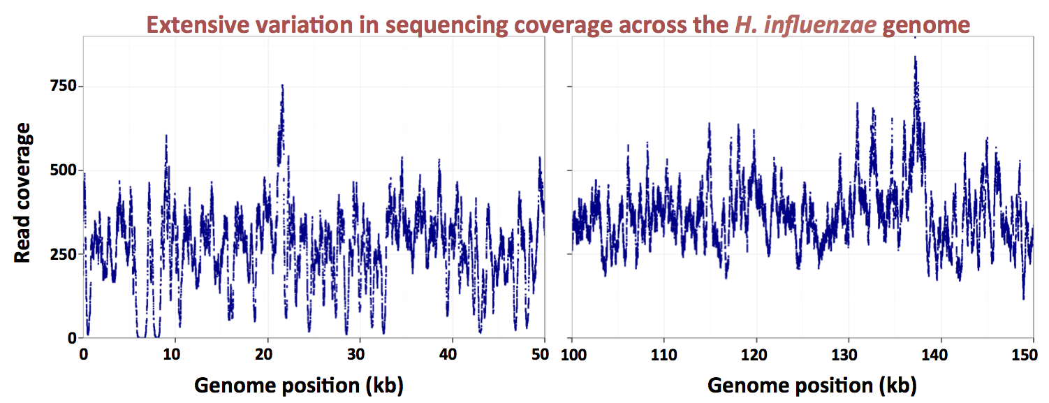
Here's a graph made by the grad student, showing the uptake ratios for two different preps of chromosomal DNA, over a 13 kb segment of the 1830 kb H. influenzae Rd chromosome. The dark blue points are for a DNA prep whose average fragment size was about 6 kb, and the red points for a DNAS prep whose average fragment size was about 250 bp.  Because the actual distributions of fragment sizes in these preps have not yet been carefully measured, I'll refer to them as the large-fragment and small-fragment DNA preps respectively.


The first thing you notice is that the uptake ratios for the large-fragment prep are much less variable than those for the small-fragment prep.  We are very gratified to see this, because it's what we expected from the known contribution of the uptake motif.  Sequences with strong matches to this motif occur all around the chromosome, with an average spacing of about 1 kb.  Thus most fragments in the large-fragment prep will have contained at least one USS, but many fragments in the small-fragment prep will not have contained any USS.

The large-fragment prep does show two strong spikes of high uptake (at about 8000 and 18500 bp).  These are certainly very interesting, especially since they don't correspond to high uptake in the short-fragment prep.  But for now I'm just going to consider how we might analyze the short-fragment prep, since this provides much better resolution of what we think are the effects of individual USSs.

Here's a strategy I came up with:

Step 1:  Score each position of the NP genome for its match to either orientation of the 'genomic' USS motif.  This motif was identified by Gibbs Motif Sampler analysis of the RD genome (see this paper).  Each position will have a '+' score and a '-' score; we need to make sure the positions are aligned at the most important of the USS motif.  Because the score depends on correct alignment, the result will be punctate, with about one high-scoring position and about 999 low-scoring positions in each kb.  Here's a figure of what the analysis might look like for the 13 kb segment shown above.


Step 2:  Using a reasonable score cutoff, create a list of positions that qualify as 'USS' for the initial analysis of the uptake data.  In the case above we'd include all positions scoring higher than 15.  

Step 3: For each position in the genome, calculate its distance from the nearest 'USS' on the above list.  For now don't distinguish between 'USS' in + or - orientations.  (I'm keeping 'USS' in quotes to remind us that we used only one of many possible criteria to define our list.)

Step 4: For each genome position plot its uptake ratio as a function of its distance from a 'USS'.  Because most of the red peaks in the grad student's graph have uptake-ratio scores of about 4 and bases about 1 kb wide, I expect the graph to look something like this: 


There are a lot more points on this graph than on the previous one because there's a point for every position in the 1.8 Mb genome.  Most of the points fall on a rough band that drops from uptake ratios of 4 (peaks, for a very close 'USS') to uptake ratios that are about 0.1 (troughs, for positions that are more than 500 bp from a 'USS').

If we see a broad band with lots of scatter, this will mean that our distance-to-the-nearest-'USS' score doesn't capture other aspects of the USS that influence uptake.  These factors might include:
  1. whether the USS's orientation on the chromosome affects uptake (USS motifs are asymmetric)
  2. how well the USS's sequence matches the several different ways we can score sequences as possible USS (genome-based, uptake-based, and with or without internal interaction effects between positions)
  3. how much the presence and relative locations of additional USSs adds to uptake
We will come back to the above analysis and develop more nuanced measures of the affects of nearby USS, judging success by how much each nuance reduces the scatter of the points.

For now I'm more interested in identifying any non-USS sequence factors that influence uptake. These factors should appear in the above graph as outliers, positions whose uptake ratio is not correlated with their USS-distance score.  Our previous analysis suggests that these outliers should be common.  If they are common, they might be clustered as shown above, but they're probably more likely to be scattered all over the place and perhaps not easily distinguishable from the overall background scatter. 

The best way to see if these positions are not noise is to see if their scores correlate with genomic positions.  Below is one way I've thought of to do this.

Step 5. 
 Use the uptake vs USS-distance graph to develop an equation that best predicts uptake ratio (U) as a function of distance to nearest 'USS' (D, in bp).  For the above example, a very crude equation might be 

U = 0.1 or (4 - D/100), whichever is greater.

Step 6:  For each position in the genome, use this equation and the 'USS' list to predict an uptake ratio, and then calculate the difference between its predicted and observed uptake ratios.

Step 7:  Now plot this 'anomaly' as a function of genome position.  If we're lucky it will look something like this:


If some of the apparent scatter is due to positions where non-USS sequences influence uptake, these will show up as peaks and troughs above and below the main bands, and we can go on to analyze these sequences bioinformatically for shared features and experimentally for direct effects on uptake.  If the scatter really is due to noise, then it will be scattered over the genome and not fall into discrete peaks and troughs.