Field of Science

Does bicyclomycin induce competence? (What was I thinking???)

Last summer I started the blog post below.
 Does bicyclomycin induce competence?
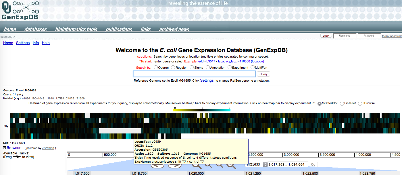
Yesterday the summer student pulled out the public data files for E. coli microarray experiments that had included measurements of sxy mRNA.  We don't know how sxy expression is controlled in E.coli - nobody has found a way to induce expression of the chromosomal gene (we used an inducible plasmid clone to study its effects on other genes).  So it's good to see that some treatments did induce it. 
In the diagram below, each coloured vertical bar represents a single microarray comparison of sxy mRNA under two different conditions.  Mousing over the bar brings up a box describing the comparison and results.  Most of the bars are black or blackish; these are comparisons where sxy mRNA levels are the same.  Yellow bars are ones where it is down (bright yellow is ≥ 8-fold down, and blue bars are ones where it is up (bright blue is ≥8-fold up) (the scale is 'log 2 expression ratio').  
It's hard for me to tell which (if any) patterns are biologically significant.  The one I'm excited about

And that's the end of the draft post!

Subsequently I found a colleague who kindly gave me some bicyclomicin (it's an antibiotic), and roughed out a simple experiment.  Now I'm planning to train up our new summer undergrad so she can do the experiment.

But I can't remember why I thought that bicyclomycin might induce competence! 

Bicyclomycin is an antibiotic.  I'd never heard of it until last summer, but it's of general interest because it's the only antibiotic that inhibits the Rho transcription termination protein.  Given that competence development is limited by folding of the 5' end of sxy mRNA, it could be that Rho-mediated termination plays a role in determining whether sxy mRNA is translated.

Searching my blog posts for 'bicyclomycin' found the unpublished post above, which tantalizingly breaks off in mid-sentence just at the point where I was about to explain my interest.  The figure is a screenshot from a microarray database, and I would expect that one of the bright-blue bars (sxy induction) would be from an array analysis involving bicyclomycin.  But that doesn't seem to be the case.  Of the five analyses with bright blue bars, one is UV irradiation, two are  biofilms, one is heat shock, and one is a glucose-lactose shift.  No mention of transcriptional termination.  Searching the microarray database for 'bicyclomycin' brings up the expression of the bcl gene, whose mutations confer resistance, and a study of transcription termination in which sxy expression is unchanged!

This microarray study of transcription used bicyclomycin to inhibit termination. So I dug farther into it to see if there were any changes in expression of the competence-gene homologs that sxy induces. Some of them are tantalizingly up (the major T4P pilin and the comABCDE-homologs that specify the secretin pore and components of the T4P motor responsible for DNA uptake), but others are unchanged.

Subsequent searching also found an email I'd send to the summer student, with a link to this termination paper (Cardinale et al. 2008), asking 'Is this the one?".  So I think this study is indeed what got me interested in bicyclomycin.

So let's see what the new summer student can find out!


More thinking/planning about the new uptake-sequencing data

Some housekeeping issues:

The sequence data:  The PhD student has found that some segments of the genome have very low coverage in the input data - some positions have coverage of zero.  This means that the calculated uptake ratios for these positions are either unreliable (low coverage) or missing (coverage = 0).  He's going to plot segments of the genome with the low coverage points in a different colour, so we can see how bad the problem is.

Part of the problem may be due to how the reads were originally mapped onto the donor genome. The mapping used a concatenated donor-recipient double genome to remove the contaminating recipient reads from the data.  Because the donor and recipient sequences used were those of NCBI reference genomes rather than of the exact cultures used for the experiment, sequencing errors in the reference genomes may have caused donor sequences to mis-align onto the recipient genome.


This can easily be checked by examining the full alignment of the input DNA.  This should not contain any contaminating recipient sequences, so any reads that align to the recipient are alignment errors.  The ideal solution would be to realign the reads using better reference sequences, but we could instead just add this misaligned coverage into the donor-aligned input dataset we're analyzing.

Any remaining positions with near-zero coverage in the input dataset should probably be flagged and removed from the analyses.

The USS-scoring matrices:  A careful reader might have noticed in yesterday's post that the two scoring matrices are not the same length.  The uptake-based matrix is 32 nt long, but the genome-based matrix is 37 nt long.  They are also not exactly aligned to each other; position 1 of the uptake-based matrix is position 3 of the genome-based matrix.  Rather than dealing with these discrepancies later (or forgetting to deal with them), we should create concordant matrices now to use for the scoring.


This requires deleting the first two positions and the last three positions of the genome-based matrix. Since the remaining last few positions have no 'information' in either matrix, we might as well delete a couple more, to give concordant matrices that are both 30 bp long.

Forward-strand and reverse-strand USSs:  Since the USS motif is not symmetric (not a palindrome in DNA language), we need to identify and specify the locations of the USSs in the two strands.  The top panel below illustrates the problem.  To keep the position references consistent, the two strands are initially scored in the same left-to-right direction, with the reverse-strand scoring done using a matrix with complementary bases in the reverse orientation.  For both strands the left end of each USS initially specifies its position in the genome, but this is a bit misleading since it's not the centre or most important position of the USS.  Worse, since the crucial 'core' of the USS motif isn't at its centre, the initial positions of the forward USSs are skewed differently than the reverse USSs.


The lower panels indicate the two possible solutions.  Both are technically easy - we just create new USS positions by adding numbers to the original positions.  In the solution shown in the middle panel, we'd add 13 (I think) to both the forward and reverse positions (sorry, the figure shows the trimmed 30 bp USS but the numbers haven't been corrected for the removal of two positions at the start).  In the solution shown in the lower panel we'd add 7 to the forward strand positions and 21 to the reverse-strand positions. (I'm not certain these are the correct numbers...)

I think either solution would be fine, but we need to pick one.


Uptake dataset progress

The PhD student has been making lots of progress in analyzing the data from the chromosomal DNA uptake experiment.

The big progress came because we realized that we needed to stop looking at the data for the whole genome and instead examine a representative 5 kb segment.  This has allowed us to relate the results of each analysis to the specific sequence features and uptake data for each position in the segment. So now we have a pretty good understanding of what the various analyses can show us, and what they can't.

Rather than detailing what we learned, here I want to consider what our goals are, and what steps we should take.

Goals:  For the analysis of transformation frequencies (the bigger project this work is part of), we want to know how much of the variation in transformation frequencies across the genome is due to differences in DNA uptake.  In principle this could just be a number, e.g. 37%.

I guess one (mindless) way to do this would be just to subtract the differences in uptake from the differences in transformation.  I don't know whether the former post-doc has done this - I'm pretty sure we haven't discussed it.

A second approach would be to determine the extent to which the already-characterized effect of USS (uptake signal sequences) on DNA uptake explains differences in transformation across the genome. Doing this doesn't require any of the new DNA-uptake sequencing data, just the sequence of the genome of the DNA source.  The former post-doc has done simple versions of this, and he has a rotation student working on a more sophisticated version.

We (the PhD student and I) are instead using the new sequence data to improve our understanding of how DNA sequences determine how efficiently a fragment will be taken up by a competent cell.  This better understanding can be then used to predict the contribution of uptake to the transformation differences (as above), but its main value is more direct - understanding how DNA sequence differences affect uptake will help us understand the evolution of uptake biases and uptake signal sequences, in H. influenzae and other organisms.

So what have we learned so far:

Size distribution of the input DNA:  We don't yet have the direct DNA-analyzer data on length distribution.  But we can indirectly estimate this by looking at the graphs of uptake ratio as a function of genome position.  Positions that are more than 500 bp from the center of an uptake peak (location of a USS) have a very small uptake ratio (~ 0.01, often not distinguishable from zero).  This means that almost all of the fragments in the short DNA sample were shorter than than 500 bp.  The mid-height widths of the (well-separated) peaks are about 400-500 bp, indicating that the average fragment was about 200-250 bp.  I haven't taken the time to get the best image for this analysis,so we can be more precise than this.

Importance of USS:  It's abundantly clear that most of the variation in uptake seen in our 'short' DNA sample is due to the locations of 'USS', sequences with strong matches to the USS motif.  Most fragments containing a strong match (score > 20 with the 'genomic' scoring matrix) are taken up several hundred times more efficiently than fragments without a good match.

We've only examined 5 kb in detail, but so far all the uptake peaks we've examined are centred on positions with strong USS scores.  The height of the peak correlates with the score.

Importance of the USS scoring matrix: We have two types of position-weight matrices for scoring how well a sequences matches an uptake-promoting motif.

The first is the 'genomic' matrix that the PhD student has been using so far., shown in the figure below. It's based on analysis of abundant USS elements in the H. influenzae Rd genome, identified using the Gibbs Motif Sampler (Maughan et al. 2010).  In the figure each bar represents a position in the motif, and its height represents the 'information content' at that position (the sum of the weighted values of each base at that position in the table).


The genomic analysis means that this matrix doesn't directly represent the preferences of the uptake machinery, but rather some combination of these preferences with other factors affecting how sequences accumulate in the genome over evolutionary time.

The second type of matrix comes from the former post-doc's direct analysis of uptake biases, done using a synthetic DNA fragment containing a degenerate USS (Mell et al. 2012).  This 'uptake' matrix gives a motif with a strong consensus only for the a much smaller region, with only four very important bases.


We haven't yet analyzed any genome uptake data using this matrix, but it's high on our priority list. We expect similar results with both matrices, but the uptake matrix may be better because it's directly based on uptake data.

How will we decide if it's 'better'?  Here, 'better' means that position USS scores better predict the uptake ratios of nearby sequences.  We're still working our way to deciding the best way to do this. In addition to the USS score from the matrix, the prediction will need to consider how far the position is from the nearest 'USS' (on a list using a good score cutoff), whether fragments containing it are likely to contain more than one 'USS', the size distribution of the DNA fragments in the prep).  Maybe some of this would be incorporated in a matrix of USS scores and distances...

Ideally (i.e. if computational time and resources were unlimited), for each focal position whose uptake we want to predict, the uptake prediction would incorporate:

  1. the USS scores at each distance from it (two scores for each distance), weighted by our observed correlation between USS score and height of uptake ratio peak
  2. For each distance, a weighting factor that reflects the probability that the focal position is in the same DNA fragment as the sequence being scored (based on the measured size distribution of the input DNA prep)
  3. A factor reflecting the interactions between USS scores at different positions, weighted by the probability that both USS would be in the same fragment.
In practice, our job is to characterize these effects and then distill the important ones into a computationally simple prediction algorithm. 

Understanding the results of the first analysis

The grad student did the analysis I had described in this post.  Here's what I had said I expected:


 And here's what he found:

His data extends over a larger scale, and there is no empty space on the left below the main peak of points, perhaps just because the dots are too big to resolve.  A few uptake ratios are as high as 10, which is  also expected.  Some of the distances to the nearest 'USS' (position on the USS list) were surprisingly large - outside of the common fragment sizes in the 'short' DNA prep, but these might represent the several places in the genome where USS are widely separated. 

The most surprising aspect was the appearance of well-defined lines of points forming peaks at distances longer than the fragment sizes, and the absence of the clusters of points I'd originally hypothesized.

These long-distance peaks made sense once the grad student identified the positions responsible for them  and checked their assigned USS scores.  At the site of the peak he found a position with a USS score only slightly lower than the cutoff he'd used when generating his list.  When he checked the USS scores for the positions of the other long-distance peaks he again found scores that were locally high but below the list cutoff. 

The figure below illustrates what we think is going on.  First consider the top graph, which is a simpler schematic version of the uptake-ratio graph in the earlier post.  It shows two local peaks in uptake, one at the site of a USS on the list, and one at the site of another uptake promoting sequence. In principle this sequence could be a lower-scoring USS, or it could be an unrelated sequence that also promotes uptake.


The lower graph shows what we expect when this data is replotted with the distance to the nearest 'USS' on the X axis.  As I originally expected, points close to the recognized USS give two lines heading down and away from position 0 (the position of that USS).  But because the other uptake-promoting position isn't recognized as a 'USS', its points show up farther along the x axis, according to their distance from the position-zero USS.

Are USS that fell below the list cutoff responsible for all of the long-distance peaks?  One simple test is to reduce the cutoff for the USS list, and see if the peaks go away.  Sure enough, when the grad student reduced his USS-score cutoff from 19.04 to 18, all but one of the peaks disappeared.  I'm a bit surprised that the long-distance low-uptake points disappeared too; I guess this means that they weren't just due to gaps in the genomic distribution of USSs.

Does this result mean that the genome doesn't contain any non-USS sequences that promote DNA uptake?  No.  There's still that one remaining peak at about 800 bp, whose USS scores need to be checked.  And there are all the points in the black part of the graph, where non-USS peaks may be obscured by all the other points.

More about analysis of the DNA-uptake sequencing data

The graph below shows the efficiency of DNA uptake relative to the 'input' DNA sample) across a 13 kb segment of the H. influenzae Rd genome.  The red dots are for a 'short' sample with average fragment size about 0.25 kb, and the blue dots are for a 'long' sample, with an average fragment size of about 6 kb  (The average lengths come from crude examination of agarose gels, which might underestimate the abundance of short fragments, so the actual length distributions will be measured with a DNA Analyzer).

The previous post considered why the red data are so spiky - each spike corresponds to the location in the DNA of a short sequence matching the uptake-signal-sequence (USS) motif. Fragments containing a USS sequence are taken up much better (maybe 25-50 times better?) that fragments lacking a USS.


But the blue data are also spiky, and I don't know why.  Ignoring the two big spikes for a minute, the spikes and dips have much smaller amplitude than the big red spikes (they don't go up as high or down as low), but they're also more frequent on the distance scale.    

The gradual rise and fall of the blue dots over distances of several kb is expected from the length distribution of the fragments, but this jaggedness is entirely unexpected, especially given the apparent smoothness of the red points between the USS spikes.  Is this just noise in the data?  Is it an artefact of how the uptake data were normalized to the input data?

The two high spikes might be a different puzzle, or they might be extreme cases of whatever is causing the low-amplitude spikiness.  How could variation in uptake of DNA fragments that are mostly at least several kb long give a spike that's only about 11 bp wide?  Could this be an alignment artefact that somehow affects 'uptake' DNA very differently than 'input' DNA?

Here's a different graph of the uptake ratios (over about 100 kb), made by the former post-doc; again we see much more spikiness in the long-fragment DNA than in the short-fragment DNA.
To investigate the cause(s), I think the first thing to do is to go back one step from the uptake ratio data and look separately at the coverage for the input DNA and the recovered 'uptake' DNA.  Luckily, the first thing the post-doc did when he got the sequencing results is to send us a screen shot of a 20 kb Integrated Genome Viewer view of the 4 sample types (long input and uptake, short input and uptake).


I'm surprised by how variable the input coverage is.  The very fine scale variation is perhaps noise, but the larger peaks and valleys (500-2000 bp) are quite consistent between the long and short input DNA samples.

Unfortunately I don't have the uptake ratio graph for the same region that I have this IGV analysis, and I don't have the R skills to generate it.  But I can ask the grad student to do it for me, and to send me his code so I can figure out how it's done.