Field of Science

What's noise, what's Illumina bias, and what's signal?

The PhD student and I are trying to pin down the sources of variation in our sequencing coverage. It's critical that we understand this, because position-specific differences in coverage are how we are measuring differences in DNA uptake by competent bacteria.

Tl;dr:  We see extensive and unexpected short-scale variation in coverage levels in both RNA-seq and DNA-based sequencing. Can anyone point us to resources that might explain this?

I'm going to start not with our DNA-uptake data but with some H. influenzae RNA-seq data.  Each of the two graphs below shows the RNA-seq coverage and ordinary seq coverage of a 3 or 4 kb transcriptionally active segment.

Each coloured line shows the mean RNA-seq coverage for 2 or 3 biological replicates of a particular strain.  The drab-green line is from the parental strain KW20 and the other two are from competence mutants.  Since these genes are not competence genes the three strains have very similar expression levels.  The replicates are not all from the same day, and were not all sequenced in the same batch.  The coloured shading shows the standard errors for each strain.


We were surprised by the degree of variation in coverage across each segment, and by the very strong agreement between replicates and between strains.  Since each segment is from within an operon, its RNA-seq coverage arises from transcripts that all began at the same promoter (to the right of the segment shown).  Yet the coverage varies dramatically.  This variation can't be due to chance differences in the locations and endpoints of reads, since it's mirrored between replicates and between strains.  So our initial conclusion was that it must be due to Illumina sequencing biases.  

But now consider the black-line graphs inset below the RNA-seq lines.  These are the normalized coverages produced by Illumina sequencing of genomic DNA from the same parental strain KW20. Here there's no sign of the dramatic variation seen in the RNA-seq data.  So the RNA-seq variation must not be due to biases in the Illumina sequencing.

Ignore the next line - it's a formatting bug that I can't delete.
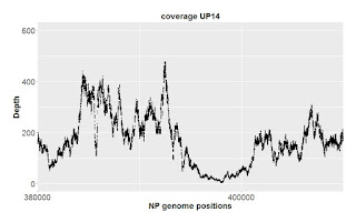
<200 and="" from="" in="" lower="" nbsp="" p="" segment.="" segment="" the="" to="" upper="">


How else could the RNA-seq variation arise? 
  • Sequence-specific biases in RNA degradation during RNA isolation?    If this were the cause I'd expect to see much more replicate-to-replicate variation, since our bulk measurements saw substantial variation in the integrity of the RNA preps.
  • Biases in reverse transcriptase?  
  • Biases at the library construction steps?  I think these should be the same in the genomic-DNA sequencing.

Now on to the control sequencing from our big DNA-uptake experiment.

In this experiment the PhD student mixed naturally competent cells with chromosomal DNA, and then recovered and sequenced the DNA that had been taken up.  He sequenced three replicates with each of four different DNA preparations; 'large-' and 'short-' fragment preps from each of two different H. influenzae strains ('NP' and 'GG').  As controls he sequenced each of the four input samples.  He then compared the mean sequencing coverage at each position in the genome to its coverage in the input DNA sample.

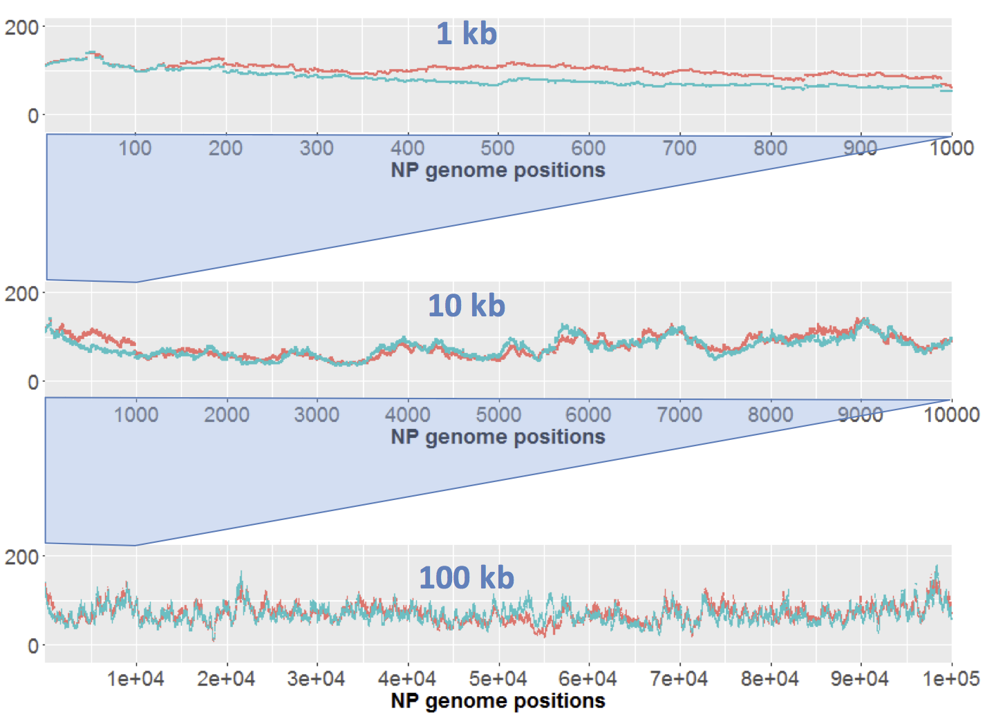
Here I just want to consider results of sequencing the control samples.  We only have one replicate of each sample, but the 'large' (orange) and 'short' (blue) samples effectively serve as replicates.  Here's the results for DNA from strain NP.  Each strain's coverage has been normalized as reads per million mapped reads (long: 2.7e6 reads; short: 4.7e6 reads).

The top panel shows coverage of a 1 kb segment of the NP genome.  Coverage is fairly even over this interval, and fairly similar between the two samples.  Note how similar the small-scale variation is; at most positions the orange and blue samples go up and down roughly in unison.  I presume that this variation is due to minor biases in the Illumina sequencing.

The middle panel is a 10 kb segment.  The variation looks sharper only because the scale is compressed, but again the two traces are roughly mirroring each other,

The lower panel is a 100 kb segment.  Again the variation looks sharper, and the traces roughly mirror each other.  Overall the coverage is consistent, not varying more than two-fold.


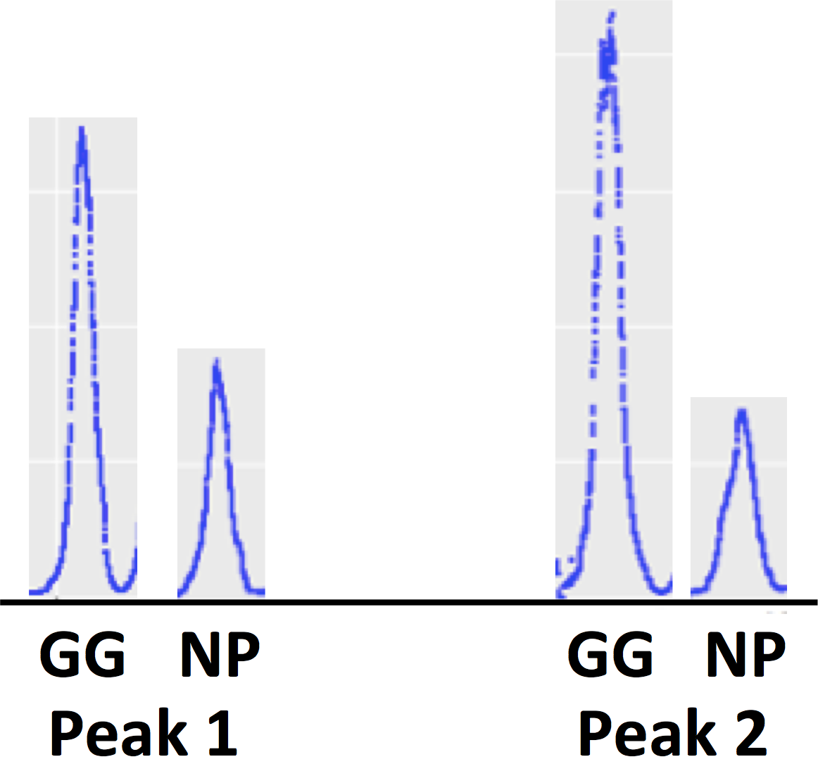
Now here's the corresponding analysis of variation in the GG control samples.   In the 1 kb plot the very-small-scale position-to-position variation  is similar to that of NP and is mirrored by both samples.  But the blue line also has larger scale variation over hundreds of bp that isn't seen in the orange line.  This '500-bp-scale' variation is seen more dramatically in the 10 kb view.  We also see more variation in the orange line than was seen with NP.  In the 100 kb view we also see extensive variation in coverage over intervals of 10 kb or larger, especially in the blue sample. It's especially disturbing that there are many regions where coverage is unexpectedly low.


The 500-bp-scale variation can't be due to the blue sample having more random noise in read locations, since it actually has four-fold higher absolute coverage than the orange sample.  Here are coverage histograms for all four samples (note the extra peak of low coverage positions in the GG short histogram):


If you've read all the way to here:  You no doubt have realized that we don't understand where most of this variation is coming from.  We don't know why the RNA-seq coverage is so much more variable than the DNA-based coverage.  We don't know how much of the variation we see between the NP samples is due to sequencing biases, or noise, or other factors.  We don't know why the GG samples have so much more variation than the NP samples and so much unexpectedly low coverage.  (The strains' sequences differ by only a few %.)

We will be grateful for any suggestions, especially for links to resources that might shed light on this. 

Later:  From the Twitterverse,  a merenlab blog post about how strongly GC content can affect coverage: Wavy coverage patterns in mapping results.  This prompted me to check the %GC for the segment shown in the second RNA-seq plot above.  Here it is, comparing regular sequencing coverage to %GC:

 I don't see any correlation, particularly not the expected correlation of high GC with low coverage.  Nor is there any evident correlation with the RBNA-seq coverage for the same region.


Do the rpoD hypercompetence mutations eliminate the normal diauxic shift?

I've been going over the RNA-seq data for our rpoD1 hypercompetence mutant, looking for changes in gene expression that might help us understand why the mutation causes induction of the competence genes in rich medium.

Here's a graph showing the results of DESeq2 analysis of the expression differences between the wildtype strain KW20 and rpoD1 cells at timepoints B1 and B2.  B1 is true log phase growth in rich medium; OD = 0.02.  B2 is OD = 0.6, when the cells are just starting to modify their growth in response to changes they've caused to the medium.  Both axes show how the rpoD1 cells differ from KW20.  The X-axis is differences at B1, and the Y axis is differences at B2.


Phenotypically, RpoD1 cells are not noticeably different from KW20 at timepoint B1. They grow at almost the same rate, and they're not competent.  This similarity is also seen in the lack of horizontal spread of the points in the RNA-seq graph; very few genes are more than twofold different between rpoD1 and KW20.  

But at B2 the  differences are larger, as indicated by the greater spread along the Y axis.  sxy mRNA is up about 3 fold, and the competence genes are increased 3-4-fold (in the green circles).  This is expected, since we know that the rpoD1 cells are competent at this stage.  The gcvB gene (a small regulatory RNA) is also up, but I haven't found any consequences of this (need to look more).  

The only other substantial change (and the largest change) at B2 is a cluster of 7 genes (HI1010-HI1016, in the purple circle) which are down 4-15-fold relative to KW20.  In KW20 these genes are induced briefly at B2 and then shut off again at B3 (OD = 1.0), but in rpoD1 their expression stays low.  The graph below illustrates this for gene HI1010, the first gene in the cluster.  (Look only at the first three time points; the others are cells in the competence-inducing medium MIV.)

What's going on around this time point that could be altered in the rpoD1 mutant?  We know that when cultures of wildtype cells reach this density they have begun to change their gene expression - they're not in true exponential growth any more (not in true 'log phase').  


Bioscreen growth curves of KW20 cultures consistently show a blip around OD = 0.6  (red arrows in the graph above), where growth briefly pauses and then resumes at a slower rate.  This type of growth has been given the name 'diauxy', and the blip represents a 'diauxic shift', a brief slowing or cessation of growth while cells shift from using one one resource to a different resource.

The change in growth rate is more obvious in the version shown below.  It uses a log scale for the Y axis, so periods of exponential growth appears as straight lines.  It's easy to see the initial period of exponential growth (red dashed line), where cell density doubles about every 35 minutes.  After the blip growth resumes, growth is slower but still roughly exponential (blue dashed line), and then gradually stops as conditions become less supportive.


Here's a graph showing all the Bioscreen traces from a different experiment, again showing the diauxic shift.  It appears to occur at a higher OD this time only because the student who made the graph didn't correct for the baseline OD of the culture medium. 

So my hypothesis is that the transient expression of HI1010-HI0116 at the B2 time point is associated with this diauxic shift.  I predict that the lack of the transient expression in the rpoD1 mutant will abolish the diauxic shift - there will be no blip in rpoD1 cultures.

I'm doing a Bioscreen run right now to test this hypothesis, comparing KW20, rpoD1 and rpoD2.  But while I was writing this post I did some digging around and found two relevant results from previous work by undergraduates in the lab.


The first graph compares KW20 to all three types of hypercompetence mutant.  The dark red line is rpoD1; consistent with my hypothesis it's the only strain that doesn't show the diauxic shift.  The second graph compares KW20 to rpoD1 and rpoD2, just like my present run.  This graph uses a log scale  so the shift appears higher in the curve, and appears to occur for all three strains.

And here are my new results (replicates with three slightly different batches of sBHI media):


Conclusion:  I was wrong.  The rpoD mutants are just as likely to show a clear diauzic shift blip as KW20.

Just to further complicate the picture, here's a Bioscreen run using a quite different strain, a clinical strain called 86-028NP, whose DNA sequences differ by 2-3% from the KW20 sequences: there's no sign of a diauxic shift.  Maybe KW20's diauxic shift was selected for by many generations of growth in lab cultures!


Later:  I reran the Bioscreen runs using Medium batch A, this time taking readings every 4 minutes instead of every 10 minutes in order to better resolve the diauxic shift.


The diauxic shift is very evident in the linear-scale (upper) plot, and appears to be identical in all three strains.  The log-scale plot (lower) unexpectedly shows rpoD1 to be growing slower than the others before the shift,.  (Unexpected since this was not seen in the first experiment.)

Analysis of NP-GG differences (I can't help myself!)

Despite my sensible conclusion to the previous post, I've rushed in with a bit of analysis of the reasons for the differences between the NP and GG uptake-ratio peaks.

I was able to do this because the PhD student just posted two new graphs, showing the uptake peaks in syntenic 20 kb segments of the NP and GG genomes.


The peaks for the two genomes are in the same places because the underlying DNA sequences are very similar.  Most of the peaks also have similar heights in the two genomes, with two obvious exceptions (labelled Discordant peak 1 and Discordant peak 2).  Here are those peaks side-by-side, to the same scale:

To look for sequence differences that could explain these uptake differences, I copied the corresponding DNA sequences for these regions from Genbank and examined them for USS.  I easily found good matches to the USS motif at (approximately) the centers of both peaks. 

Here are the GG and NP sequences for Peak 2, which has the bigger difference in height.  I've included a logo showing the USS-uptake motif we determined earlier.


There are lots of differences over this 66 bp segment.  None are in the 9 bp USS core, but there are 4 base substitutions and a single-base deletion in the 'unimportant' parts of the motif, and 5 more substitutions nearby.  In principle any of these differences could be responsible for the uptake difference.

But here are the corresponding sequences for Discordant peak 1.  (It's in the other orientation in the genome.)


This is completely different from Peak 2.  There's only one difference between the GG and NP sequences, and it's outside of the USS motif.

Might the sequences outside of the known USS motif be important after all?  Here is a comparison between the USSs of Peak 1 and Peak 2.  (To get both USSs in the same orientation I took the reverse complements of the Peak 2 sequences.) 
The orange vertical lines indicate positions where the Peak 1 and Peak 2 sequences differ.  Outside ogf the USS there are more differences than identities; we expect this because these sequences are unrelated.  Peak 2 is in an acetyltransferase gene, and Peak 1 is in a helicase gene.

So, this analysis didn't find any sequence differences likely to explain the uptake differences.  We certainly need to repeat this for other syntenic segments (= most of the genomes).  ANd we should examine individual discordant peaks at higher resolution, to see if the peaks in both NP and GG are centered on exactly the same sequences.

What about the possibility that the genomes have methylation differences that cause the uptake differences?  That's certainly possible - I wonder if there's an easy (bioinformatics) way to check.

p.s.  The PittGG annotation in Genbank is a mess.  I spent 2 hours figuring out why the segments appeared to have different genes.

Unexpected differences in uptake of DNA from two closely related strains

The PhD student's long careful reanalysis of the DNA uptake data has finally produced uptake ratio plots.  These confirm a surprising difference between the DNAs from two closely related strains, 86-028NP ('NP') and PittGG ('GG').  We also saw this difference in our preliminary analysis, but we thought it might be an artefact of how the analysis was done.

In the experiment underlying this data, cells of a third strain, KW20, took up DNA that had been purified from NP or GG cells.  We recovered the taken-up DNA and sequenced it, comparing how well each position in the ~1,800,000 bp genome was represented in the 'uptake' DNA relative to parallel sequencing of the 'input' NP or GG DNA.

We expected to see peaks and valleys of high and low DNA uptake, because we knew:

  • that the DNA of each strain contains many occurrences of a short sequence that's strongly preferred by the DNA uptake machinery *'uptake sequences'),
  • that the DNA had been broken into fragments so small that most of them wouldn't contain this sequence.

The two strains' DNA sequences are only 2-3% different, and we've found that uptake sequences are usually less variable between strains than other sequences,.  Thus we expected the overall pattern of uptake to be very similar between the two strains (approximately the same number of peaks, and approximately the same distribution of peak heights).

We don't know what causes this difference.  We'd expect it to be differences in the sequences of the two genomes, since both DNAs were highly purified before use.  But it could be a methylation difference, since the two strains might contain different methylation systems, especially those associated with restriction-modification genes.

The graphs below show that the numbers of peaks are quite similar, but their height distributions are not.  For DNA from strain NP (upper graph), most of the peaks have quite similar heights, and almost all are between 3.5 and 4.5.  But DNA from strain GG (lower graph) has much more variation, with many peaks below 2.5 and many higher than 5 or even 10.
Below is the same data, this time plotted on log scales.  This lets you see how deep the valleys are, and how high the highest GG peaks are.


Cause of the strain differences?

We don't know what causes this difference.  We'd expect it to be differences in the sequences of the two genomes, since both DNAs were highly purified before use.  But it could be a methylation difference, since the two strains might contain different methylation systems, especially those associated with restriction-modification genes.

In principle, sequence differences in the uptake sequences could accumulate over evolutionary time if one strain had lost the ability to take up DNA.  But in lab experiments strains GG and NP both transform poorly relative to the highly transformable lab workhouse strain KW20 (NP a bit worse than GG).

How to find out the cause?

In his preliminary analysis the PhD student examined uptake sequences associated with the high and low GG peaks and didn't see any obvious differences.  We'll want to do this again with the improved datasets.

We can do this at a more detailed level, examining specific uptake sequence occurrences at positions of high and low uptake.  We should particularly focus on parts of the genomes where the NP and GG genomes are 'syntenic' - where they have homologous sequences in homologous locations.  That will let us compare pairs of NP and GG uptake sequences that we know share a recent evolutionary ancestor.

Let's not rush into this

I 'm keen to find out what's going on, but I think it's important to exercise restraint.  We should proceed systematically through the analyses we've planned, rather than jumping onto this tempting problem.

How many contamination-control replicates can we do?

This is a continuation of the previous post.

For each of our 12 genuinely contaminated uptake samples we want to create multiple replicate fake-contaminated input samples, each fake-contaminated with an independent set of Rd reads at that sample's level of contamination.
For example, our UP01 sample has 5.3% Rd contamination.  Its corresponding input sample is UP13.  UP13 has about 2.7 x10^6 reads, so to make a fake-contaminated sample for UP13 we need to add (2.7x10^6 * 0.053)/(1-0.053) = 1.5x10^5 Rd reads to the UP13 reads.
Since our Rd sample contains 4,088,620 reads, for UP01 we could make 27 such fake-contaminated sets.   Other samples might need more Rd reads per set, and we wouldn't be able to make so many sets.

We'd like to use the same number of replicate sets for each of our 12 uptake samples, so we need to identify the uptake sample that needs the most reads per set, and thus has the lowest number of possible sets.  The table below shows that this is sample UP08, which needs 943,299 reads per set and thus allows creation of only 4 independent sets, and thus 4 independent fake-contaminated input samples.  This value is lowest because UP08 has a very high level of Rd contamination (16.6%) and its corresponding input control sample (UP15) is quite large (4.7x10^6 reads).  It's not the largest control sample (that's UP16 with 1.0x10^7 reads), but the uptake samples corresponding to UP16 have much less contamination than UP08 does.


So we should plan on creating 4 independent fake-contaminated input samples for each uptake sample, and then using the average coverage of these 4 samples as the denominator in the uptake ratio calculation.

Almost there: making the uptake ratio graphs

Yesterday the PhD student showed me the results of his contamination-correction tests.  They confirmed that our new error-correction strategy works, and suggested an improvement.

The problem and the strategy:  We want to know how efficiently different segments of NP or GG DNA are taken up by competent Rd cells.  All of our 12 'uptake' samples are contaminated, consisting of mostly reads of NP or GG DNA taken up by Rd cells plus varying amounts of contaminating Rd chromosomal DNA.  We want to calculate the 'uptake ratio' for each genome position as the ratio of sequence coverage in the uptake sample to coverage in the 'input' sample - thus correcting for the varying efficiency of sequencing at different genome positions. We originally tried to identify and remove the Rd-derived reads from the uptake samples before calculating the uptake ratio, but this introduced new problems.  Our new strategy is to instead deliberately add 'fake-contaminating' Rd reads to our input samples, at levels matching the real contamination in each uptake sample.

The test:  To test whether the new strategy works, the PhD student first created a set of four fake-uptake samples by adding 10% of Rd reads (set 1) to each of the four input samples (NP-long, NP-short, GG-long, GG-short).  He then created the corresponding fake-contaminated input samples by adding different Rd reads (set 2) to get the same 10% contamination level.  He then calculated and plotted the ratio of fake-uptake to fake-input for each genome position.  If the contamination correction were perfect this would give a value of 1.0 at every position, but we knew it would be imperfect because the contamination reads (set 1) and the correction reads (set 2) were not identical.

Here are the results for the NP-long analysis (the NP-short was similar):


The top graph shows a 10 kb segment; the bottom one the whole genome.  The uptake rations are nicely centered at 1.0, varying from about 0.9 to about 1.1.  This variation is expected, due to the random differences in Rd coverage by set 1 and set 2.  The segments with no variation are places where the Rd genome has no homolog in the NP sequences.

Here are results for GG-long:


This result is noisier, with many spikes above 1.1 and dips below 0.9.  The cause was easy to find:  the spikes and dips occur at positions where sequencing inefficiencies cause very low GG coverage.  Below are coverage graphs for the 10 kb segment in the first graph above, and for a 30 kb segment around the major spike/dip at position 400,000 in the whole-genome graph above.  In each case we see that sequencing coverage is much lower at the spike-dip positions, causing the chance differences in Rd coverage to have a much bigger effect than elsewhere. 

In principle, the role of chance differences between the set 1 and set 2 Rd coverage can be checked by examining the other GG sample, GG-short, but I think the PhD student used exactly the same sets of Rd reads for this sample as for the others, which would predict that the spikes and dips should be the same.  They're not, probably because of differences in GG coverage between the long and short samples.


We should go back and test the same GG-long sample using different sets of Rd reads (set 3 rather than set 1, or set 4 rather than set 2).

Sources of variation:  The above analysis gives us a better understanding of the sources of variation in this uptake analysis.  First there's the variation across the genome in sequencing efficiency.  This is (we think) due to properties of the sequencing technology, and should be constant across different samples from the same genome (e.g. input and uptake samples). We don't have any way to reduce this variation, but we control for it by calculating the uptake ratios rather than just position-specific differences in coverage in the uptake samples.  Second, there's the variation in how much Rd contamination is present.  This arises due to variation in the experiments that purified the DNA; we can't change it at this stage, but we control for the differences between samples by introducing different amounts of compensating fake-contamination into the input sample control for each uptake sample.  Third, there's the chance variation in the distribution of contaminating Rd reads across the genome.  This will be different for each sample, and we can't change it or control for it.  Finally there's the random variation in the distribution of fake-contaminating Rd reads added to each input sample.  The next section describes how we can eliminate most of this.

Replicate corrections will reduce variation:  The above analysis also showed us a way to improve the correction in our 12 genuinely contaminated samples.  Instead of doing each correction once, we can do the correction several times, generating independent fake-contamination input samples using independent sets of Rd reads.  Then we can average the resulting uptake ratios.  In fact we can do this a simpler way, by just averaging the coverage levels of the independent fake-contamination input samples at each position, and then calculating the uptake ratios using these averages.

The number of Rd reads needed for each correction will depend on the coverage level and true contamination level of each uptake sample, but we should have enough Rd reads to create at least five four independent sets for each sample (see next post).