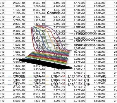
I've got a lot of data to analyze from all the simulations I've run, so I'm going to try using the Mac Numbers app instead. Whoa, doesn't look good. Here's what the default for a line graph produced:
 Weird? Let me count the ways.
- The background is transparent.
- This is a 3-D graph.
- The lines are 3-d, like ropes.
- The lines have 3-D shadows.
- There are no visible axes.
- There is no scale.
- There are some numbers connected to some of the lines.
- The legend at the bottom seems to treat the X-axis values as Y-axis values.
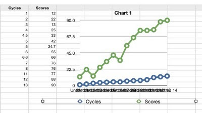
Ah, the problems with the previous graph were partly that I had accidentally chosen 3-D. But my new graph is terrible too.

- The symbols are enormous and I can't find any way to change them or remove them.
- My X-axis values are being treated as Y-axis values - I don't know what it's using for the X-axis as the numbers are illegibly jammed together.
- My column headings (Cycles, Scores) are ignored.
Aha, changing to a scatter plot got it to use my Cycles data for the X-axis values. But now the lines connecting the points have disappeared and I see no way to get them back. And the new legend says that the Xs represent cycles, when they're really Scores. Instead moving the Cycles data over into the grey first column gave a semi-presentable line graph, but now it's not treating the Cycles values as numbers but as textual labels, even though I discovered how to tell it that they are numbers.
I'm afraid Numbers appears to be just a toy app, suitable for children's school projects but not for serious work. I would RTFM but I can't find anything sensible.


Numbers is a fairly powerful program, but it's not Excel, and you can't use your Excel experience as a guide in Numbers.
ReplyDeleteTo edit your graph you need to go to the Inspector (the floating box; hit Cmd-I if it's not shown). Click the Chart icon (a stylized bar graph). You can now edit all the axis parameters, the number of column headings, the size of the symbols, etc. You can change orientation of the text, etc. Switch X and Y axes with the little icon that is adjacent to your data.
It's hard to show over the 'net, but all your problems would take about 15 seconds to change.
Once I got used to each, I find it much easier to edit optimize a Numbers chart than Excel. But again, Numbers is not Excel, and you can't try to edit a Numbers chart as if it's an Excel chart. (If you're still in the midst of a grant preparation, this isn't the right time to learn Numbers, of course.)
That said, there are a few things Excel does better than Numbers. Conditional formatting is much more flexible in Excel, for example. But for about 90% of my charts and tables I use Numbers.
I haven't had any problem using Excel on Snow leopard, but I don't think I've used the Office '04 version, just the Office '08.
Have you checked out Open Office? I keep thinking that I will but haven't gotten to it yet.
ReplyDeleteAnd I am *slowly* getting more proficient at the graphing functions in R. I really need some "R for the programming-challenged" sort of crash course.
@iayork: I did try working with the controls in the Inspector, but I couldn't figure out how most of them worked. I kept going back to the graph and double-clicking on components, hoping some controls would pop up. Can you recommend a manual or help file that explains how to use it for simple sciency graphs? All I could find was some babyish stuff on the Mac pages? I guess I could have tried clicking on Help...
ReplyDeleteI was going to try again now, on my home computer, but it appears to only have the 06 version of iWork, with Keynote and Pages but no Numbers).
As the former Redfield lab postdoc with Office 08, I can recommend the upgrade. The first few months were frustrating because several key functions had been removed from Excel, like the ability to define error bar values, but updates have restored these functions and improved stability.
ReplyDeleteNevertheless, I've made the transition to Pages for word processing, and use Prism for all graphing because it is a graphing/analysis program for scientists (unlike Excel and Numbers). I've heard that Prism has problems in Snow Leopard, but fixes are in the works.
ROsie - I don't know of a good tutorial (I haven't looked). I learned through trial and error. It's easier when you start with simple stuff and gradually move on to real data, which by chance was what I did.
ReplyDeleteWhat I've done is make a couple quick movies of me making a line graph and a scatter plot and editing the graphs. Maybe they will give you a starting point for approaching your own. No sound, because my kids are still in bed ...
I've never tried to do one of these before, so hopefully it will work for you. I tried to go a little slow and make things explanatory, which seems to have resulted mainly in randomly waving the pointer around, but whatever.
(By the way, iWorks '06 really was too simplistic, it wasn't until the '09 version that Numbers and Pages actually became usable enough to displace Office for me.)
Line graph (7.8 MB, probbly see first): http://www.iayork.com/Movies/11-9-09/NumbersLineGraph.swf
Scatter graph (5 MB): http://www.iayork.com/Movies/11-9-09/NumbersScatterGraph.swf
Aiayork: Aah, I'm starting to catch on. Thanks for the movies! What I had was iWorks 08, so I've downloaded a trial version of iWorks 09.
ReplyDelete@BB: I've been hoping not to have to learn R before I die. But the post-doc is learning it - I'll ask him whether I should too.